What Customer Photos Teach Jewelers About Curating an Irresistible Ring Case
Learn how customer photos reveal ring case layouts, lighting, and displays that boost curiosity and convert more foot traffic.
What Customer Photos Reveal About a Ring Case That Stops Shoppers in Their Tracks
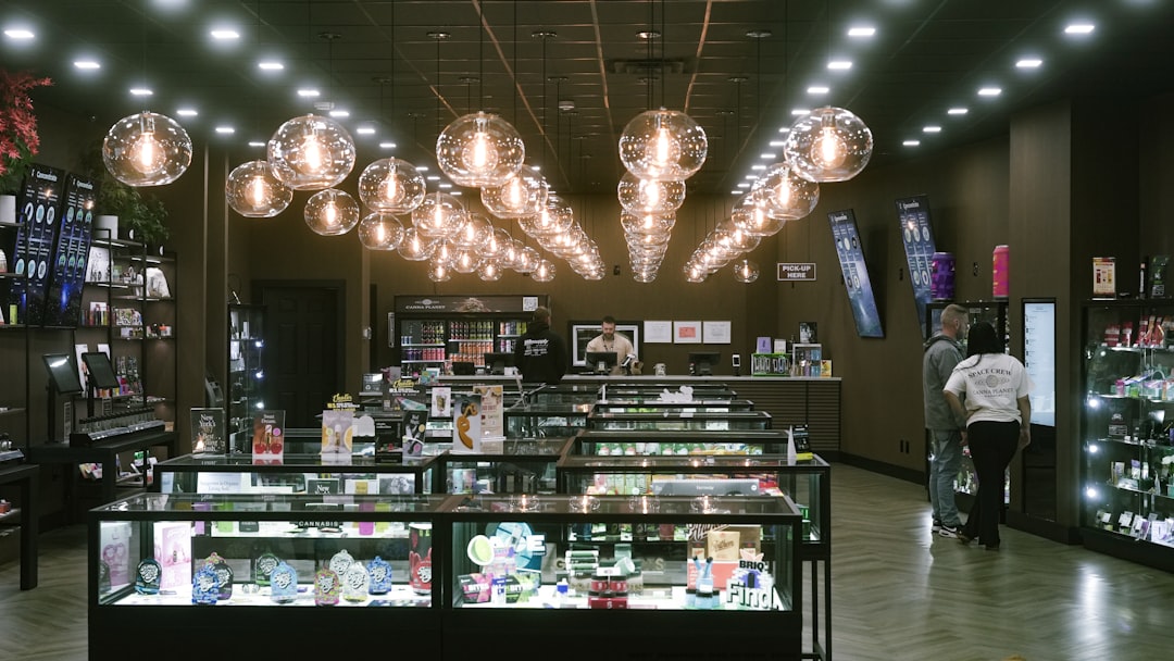
Customer-uploaded photos are one of the most underrated forms of retail intelligence in jewelry. Unlike polished brand photography, customer photos show what actual shoppers notice first: the spacing between rings, whether the lighting flatters stones or flattens them, and how crowded or calm a case feels when viewed at eye level. In a niche like emerald rings, this matters even more because color, depth, and inclusions can disappear under harsh illumination or get lost in a cluttered layout. When you study candid galleries on platforms like Yelp, you’re not just looking at images—you’re studying foot traffic conversion in the wild.
For small retailers, the lesson is simple but powerful: ring case curation is a visual merchandising problem, not just a display problem. The shops that generate curiosity tend to have a rhythm in their arrangement, a controlled glow, and a sense of abundance without chaos. This is the same logic behind effective store layout decisions, where the right placement attracts more walk-ins before a shopper even crosses the threshold. In other words, the case itself becomes the first salesperson.
Think of customer photos as a real-world test panel. They reveal what a visitor thought was worth capturing, which often correlates with what felt unusual, beautiful, or trustworthy enough to share. If you want to build a case that converts, you need to study what shoppers photograph—not just what your creative team prefers. That is how you turn retail photography into a source of repeatable merchandising insight, especially when your goal is to sell certified emeralds with confidence and style.
Pro Tip: The best ring cases are rarely the most expensive-looking; they are the ones that make a shopper lean in. That lean-in moment is the visual equivalent of intent.
Why Candid Images Outperform Polished Brand Shots for Merchandising Research
Customer behavior shows up in framing, not just in captions
Professional images tell you what a retailer wants customers to see. Customer photos tell you what customers actually saw. A tightly framed shot of one standout ring may indicate that a display has a strong hero piece, but a wider, slightly messy gallery image often reveals the true retail environment: the real amount of inventory, the case density, the reflection quality, and whether shoppers had to crane their necks to see the details. That makes customer photos especially valuable for jewelry display analysis because the photo itself is a record of attention.
Retailers can borrow a page from how brands study other forms of user-generated content. Just as content teams analyze creator briefs that turn influencer content into search assets, jewelers should treat gallery images as operational evidence. What angles are repeated? What displays are centrally featured? Which ring styles keep appearing in buyer photos, even when the store has many categories? The patterns are rarely random. They show what the eye is magnetized toward under real shopping conditions.
Those patterns can also reveal whether your lighting and case design support confidence. If shoppers repeatedly photograph rings against bright glare, the display may be too reflective. If photos are consistently taken from the same side of the case, you may have a lighting hotspot or traffic bottleneck. The same kind of observation is used in other retail and service categories when teams compare customer friction points, similar to how businesses review due diligence checklists for niche platforms before they commit to a new vendor or channel.
Curiosity is the first conversion signal
Foot traffic conversion does not begin when a customer asks for a price. It begins when they pause, lean, point, or photograph. In a jewelry store, curiosity is the earliest measurable sign of buyer intent, and candid images often capture the exact products or displays that triggered it. A ring case that inspires photos is doing more than looking attractive; it is creating a story worth documenting.
That story is especially important for emerald rings, because shoppers need more time to evaluate color, clarity, cut, and setting. A case that feels inviting rather than intimidating gives the buyer permission to slow down. When a customer photo shows several rings arranged with breathing room, it suggests the case made comparison easy. When the image shows a dramatic spotlight on one center ring, it suggests the store understood how to create a hero moment. Both are valid tactics, but they serve different goals.
Retailers should also think beyond simple aesthetics and consider trust. A shopper who photographs a case may be signaling that the display appears credible enough to inspect closely. This parallels the way buyers judge trustworthy sellers in other markets, much like shoppers evaluating safe import buying channels or comparing return policies before purchase. In jewelry, trust is built visually before it is stated verbally.
Customer galleries reveal what social proof really looks like
Traditional social proof often means testimonials or star ratings, but customer photos are an even richer signal because they show real-world proof of popularity. If a ring case appears repeatedly in galleries, it implies a destination effect: people visited, noticed the selection, and deemed it share-worthy. That effect can be more persuasive than a branded ad because it feels discovered rather than promoted.
Small retailers can use this to their advantage by designing for photo-worthy moments. A ring case with one thoughtfully lit emerald halo, one contrasting diamond band, and one custom piece with unique profile work can create a visual rhythm that invites comparison. That kind of arrangement gives shoppers a reason to pause and perhaps post. The broader marketing principle is similar to what high-performing creators use when building repeatable assets, as seen in relationship-building strategies for creators and in publisher monetization through vertical intelligence, where the objective is to understand what audiences repeatedly engage with.
The Ring Case Curation Framework: What to Place, Where to Place It, and Why
Use a hero-focal structure instead of uniform density
The most effective ring cases are usually not evenly packed. They are structured around a focal point, with supporting pieces arranged to guide the eye. Think of it as a three-zone system: the hero ring, the comparison cluster, and the supporting edge pieces. Customer photos often show that a single standout ring placed slightly forward or centered under cleaner light draws the most attention, while surrounding rings create context without competing for the same visual space.
For emerald rings, a hero-focal structure can highlight color differences elegantly. A richly saturated emerald in a sculptural setting can serve as the centerpiece, while lighter-hued or differently cut stones around it help shoppers understand the range of options. This approach mirrors the way buyers respond to a single smart value proposition in another category, similar to the logic behind buyer checklist decision-making: one anchor product, then comparison points that clarify why it stands out.
Do not place all high-value pieces along the same visual plane. Stagger height slightly, vary band direction, and let one or two rings breathe. Candid photography tends to reward asymmetry that still feels orderly, because the eye is guided naturally. When every item is equally front-facing and equally bright, the case can look sterile, and shoppers may not know where to begin.
Keep density high enough to signal variety, low enough to signal control
One of the most consistent insights from customer-uploaded photos is that shoppers tend to photograph cases that feel abundant but manageable. Too sparse, and the case looks understocked or expensive in an unapproachable way. Too packed, and it becomes visually exhausting. The sweet spot is a curated density that suggests selection without clutter.
This is especially important for smaller retailers competing against larger chains. A disciplined ring case can make a modest inventory feel highly edited, which increases perceived value. It also helps create a perception of expertise: if the retailer can choose this carefully, the buyer assumes the same care went into sourcing. The same principle appears in other retail strategy content, such as predicting retail flash sales and adapting strategy to changing brand leadership, where disciplined selection outperforms broad, unfocused coverage.
A practical rule: if a customer can identify the “best ring in the case” from two steps away, your arrangement is probably working. If they need to scan every corner of the display before noticing anything, the case is too busy or too flat. Visual merchandising should reduce cognitive load, not increase it.
Group by shopper logic, not by inventory logic
Many jewelers organize cases by SKU, vendor, or price tier, but shoppers think in stories. They compare by style, finger presence, stone color, setting height, and emotional use case. Customer photos often reveal which clusters people find naturally comparable. For example, a ring case that places three emerald rings with different halo proportions next to one another may be photographed more often than a display organized alphabetically by designer, because the shopper can instantly see the tradeoffs.
A good display should answer shopper questions before they are asked. “Which ring feels most delicate?” “Which one looks bold?” “Which one would suit everyday wear?” Those are the mental categories that drive movement from glance to touch to try-on. It is the same reason why practical comparison guides perform well in other industries, whether readers are weighing used cars under budget or comparing high-quality creative outputs. People buy faster when the decision structure is visible.
Lighting Lessons Hidden in Customer Photos
Why bright does not always mean better
Jewelry lighting is notoriously tricky. Customer photos frequently expose cases where the lighting is technically bright but visually harsh, washing out gemstone color and creating reflective glare on glass. Emeralds are particularly vulnerable because their beauty depends on saturated depth, not just sparkle. If your case lights flatten the stone, the customer photo will often show it immediately.
Better lighting usually combines softness and direction. A slightly angled spotlight can reveal the depth of an emerald without turning the stone into a mirror. Warm-neutral illumination tends to flatter both metal and gemstone better than overly cool light, especially when the goal is to create a welcoming retail atmosphere. Store teams should inspect their displays from customer eye level and through phone camera screens, since most candid shots are taken on mobile devices and can reveal harshness that the naked eye overlooks.
For visual merchandising teams, this is a good place to think like a test-and-learn operator. Just as businesses evaluate lighting choices by environment or compare trustworthy tools in high-stakes settings, jewelry retailers should run simple lighting audits. Test one case under softer light, another under brighter front light, and compare which version gets more photographing, more touching, and more requests for price.
Use contrast to make emerald color visible
Emerald rings need contrast to come alive. Customer photos often show that dark or neutral backgrounds perform best because they allow green tones to stand out. Velvet inserts, brushed charcoal trays, and subdued gold accents can help the stone read more richly than mirrored or pale surfaces. If a customer’s photo captures your emeralds clearly, you have likely achieved the right visual tension between background and gemstone.
Contrast also helps ring shape communicate quickly. Halo settings, east-west emerald cuts, and vintage-inspired mounts need distinct silhouettes. When the case background is too busy, those forms blur together, and shoppers lose the emotional hook. This is one reason why curated retail presentation matters more than sheer assortment size. A controlled backdrop lets the product become the story.
There is an important trust dimension here as well. Shoppers instinctively associate visible detail with authenticity. If an emerald appears lifeless in your case, the customer may unconsciously question its quality. That is why retail presentation and product confidence go hand in hand, much like how consumers evaluate trustworthy digital products before they commit to them.
Phone-camera visibility is the new standard
Many jewelers still design for the naked eye, but customer photos are taken through lenses. That means the display must survive compression, reflections, and imperfect angles. A case that looks gorgeous in person but muddy in photos is not optimized for modern discovery behavior. Since people share what they can document, not just what they can admire, your display should be camera-friendly from multiple directions.
Set up a simple test: take phone photos from the height and position of a walking customer, not from above the case. Then review the images for glare, shadow pooling, and focal confusion. If the rings blend into the tray or the glass reflection is stronger than the jewelry itself, you have a merchandising problem. This mirrors how businesses stress-test content and systems, as seen in post-purchase experience optimization and workflow tool selection: the user’s actual path matters more than the ideal one.
Store Layout Signals That Increase Foot Traffic Conversion
Make the window and the case tell the same story
A common mistake is to create a beautiful window display that promises one experience and then a ring case that feels unrelated. Customer photos often reveal whether shoppers were drawn by a cohesive story or merely by isolated sparkle. The strongest stores connect the window, the entry path, and the case so the customer experiences one visual language from sidewalk to counter.
That coherence matters because shoppers frequently decide whether to enter based on a five-second impression. A window that signals modern elegance, then a case that signals abundant variety, creates a better conversion path than a display that feels generic or disconnected. Retailers looking for a broader place-based perspective can borrow from block-selection strategy, where surrounding context shapes first impressions before a visitor ever engages with the product.
For emerald jewelry specifically, the story should often combine heritage and clarity: classic enough to feel timeless, fresh enough to feel wearable, and transparent enough to inspire trust. If customer photos consistently show one corner of the store as the natural stopping point, that is often your best merchandising real estate. Put your strongest curated selection there.
Design for dwell time, not just pass-through traffic
Foot traffic conversion is rarely about getting more people to walk by. It is about getting people to stop. Customer photos tend to capture the displays that made people linger, and lingering is the precursor to asking questions. A case that encourages dwell time will have an obvious entry point for the eye, an intuitive comparison path, and enough variation to reward close inspection.
One useful tactic is to create a “pause zone” near the ring case: a slightly open sightline, a clean counter edge, and enough physical space for a shopper to place a bag or gesture comfortably. The same principle appears in project-focused environments, where layout influences whether people can stay engaged. In retail, if the space feels cramped, customers leave mentally before they leave physically.
Another useful tactic is to reduce competing visual noise around the case. Too many signs, too many promotions, or too many unrelated objects around the jewelry can dilute the attention signal. If you want candid photos that showcase your ring case, the surrounding environment needs to support the jewelry, not fight it.
Train associates to read visual cues before they read questions
Shoppers who photograph a ring case are giving off a strong nonverbal signal: they are interested enough to document. Sales associates should be trained to notice that cue and respond with supportive, non-pushy engagement. A helpful associate can bridge the gap between curiosity and purchase by pointing out material differences, suggesting try-ons, or comparing emerald treatments in a confident, friendly way.
That training matters because a well-merchandised case can attract attention, but service closes the loop. Small retailers often win by being more responsive, more transparent, and more educational than chain competitors. In that sense, the associate is part of the visual merchandising system. The approach resembles how high-performing organizations handle evolving expectations in areas such as customer insights management or how they prepare for clear messaging when markets shift: the response must match the moment.
A Practical Comparison of Ring Case Styles and Their Likely Effect on Shoppers
Not every display strategy serves the same objective. A luxury-forward case may increase perceived exclusivity, while an educational case may increase comparison shopping. The table below helps small retailers choose a display style based on the behavior they want to encourage. Use it as a merchandising blueprint before rearranging trays or changing lighting.
| Display Style | Visual Signal | Best For | Potential Risk | Customer Photo Outcome |
|---|---|---|---|---|
| High-density luxury case | Abundance and prestige | Established stores with strong brand trust | Can feel overwhelming if poorly lit | Often photographed for “wow” factor |
| Minimalist hero case | Focus and exclusivity | High-value emerald rings and custom pieces | May look understocked if inventory is weak | Strong close-ups, fewer wide shots |
| Comparison cluster case | Choice and clarity | Education-driven selling | Too many similar items can blur distinction | Encourages side-by-side photography |
| Warm vintage case | Heritage and romance | Antique, halo, and Art Deco settings | Can feel dated if not refreshed | Photographs well when contrast is controlled |
| Open-air modern tray | Accessibility and freshness | Millennial and Gen Z shoppers | Security and glare issues | Generates casual, candid, lifestyle-style shots |
Use this framework alongside your sales goals. If your objective is to create urgency, the minimalist hero case may perform best. If your objective is to help buyers compare emerald rings by shape and setting, the comparison cluster is usually superior. For retailers balancing both goals, rotate the display quarterly and track which arrangement appears more often in customer photos, receives more questions, and produces stronger conversion at the counter.
How to Build a Customer-Photo Feedback Loop Without a Big Budget
Audit your gallery images like a merchandiser
Start by collecting customer-uploaded images from public platforms, tagged posts, review sites, and any in-store photo submissions you have permission to use. Then sort those images into categories: wide case shots, close-up product shots, lighting-heavy shots, and shopper-context shots. Look for repeated patterns in where the camera lands and what details remain visible despite the imperfect conditions of real life.
From there, compare the photos against your physical setup. Are the same rings appearing repeatedly because they are closest to the register? Are shoppers photographing the left side of the case more than the right because it is better lit? Does one tray always look more inviting because its background makes the stones pop? These are operational clues, and they are often more useful than formal surveys because they are tied to actual behavior, not memory.
For retailers who want to strengthen this process, the discipline is similar to working with structured content systems such as SEO content briefs or with evidence-based evaluation methods such as reasoning workflows. The point is to convert raw observation into an actionable standard.
Track three metrics: pause rate, photo rate, and ask rate
Small retailers rarely need a sophisticated analytics stack to improve ring case curation. A simple manual log can be enough. Pause rate measures how often shoppers stop at the case. Photo rate measures how often they take or request a photo. Ask rate measures how often they request pricing, try-ons, or gemstone details afterward. These three behaviors tell you whether the display is attracting attention, generating curiosity, and moving buyers toward a conversation.
Over time, compare the metrics by display version. You may discover that one arrangement gets fewer pauses but more photo captures, which suggests it is visually distinctive. Another may get many pauses but few questions, which can mean the display is pretty but unclear. This kind of performance thinking is common in modern retail and media, from microcontent performance analysis to sustainability-focused operations planning, because small improvements compound.
Turn shopper curiosity into a repeatable display standard
Once you find a version that consistently attracts attention, document it. Photograph the tray layout, note the light angle, record the distance between hero ring and neighboring rings, and keep a simple checklist for staff. Without this step, the best display is easy to lose when inventory changes or teams rotate.
Also train staff to maintain the logic behind the arrangement rather than merely copying the look. If a new ring arrives that belongs in the hero position, they should understand why it belongs there. If a tray is full, they should know which pieces deserve visual priority. This is how small retailers preserve visual merchandising quality even when sales volume, staffing, or inventory mix changes.
Advanced Styling Tips for Emerald Rings in Particular
Let green do the selling
Emerald rings have a visual advantage: the color itself is memorable. But that advantage only pays off when the display lets the green breathe. Customer photos often reward cases where emeralds are isolated enough to read clearly against the tray and adjacent metals. Pairing emeralds with complementary diamonds or warm gold can intensify the green, while overly busy surroundings can dull it.
Use at least one ring in each display that demonstrates a different emerald personality: one vivid and clean, one classic and vintage-inspired, and one design-forward or custom. This helps shoppers understand range, not just quality. It also supports better conversations about price per carat, treatments, and overall value, because the visual context makes those differences easier to explain.
Use candid-photo thinking to improve trust around treatments and grading
Because emerald buyers are often worried about authenticity and treatment disclosure, your ring case should visually support trust. Clear labeling, clean spacing, and consistent presentation help reinforce that your store is organized and transparent. When the display looks haphazard, shoppers may assume the same about sourcing or certification. A polished but honest case says, “We have nothing to hide.”
That is particularly important when you are selling certified pieces or bespoke work. Customers who photograph your case may later revisit the image while comparing options at home. If they can still identify the ring and remember the context, your display has done part of the education for you. This is a key advantage in a market where buyers increasingly value visible proof, similar to how consumers look for reliable signals in risk-sensitive purchasing decisions and in high-trust technical products.
Display custom work like an invitation, not an endpoint
Custom emerald rings should be displayed as possibilities, not trophies. A good customer photo often captures a bespoke piece because it feels both distinctive and attainable. Place custom work where it can spark imagination, but not so centrally that it intimidates shoppers who are still exploring. The goal is to suggest, “This level of craftsmanship is within reach,” rather than, “This is for someone else.”
One of the best ways to do this is to pair custom work with an adjacent reference point: a classic setting, a simpler band, or a comparable stone size. That way, the shopper can visually ladder from entry-level interest to premium aspiration. This is the same strategic logic behind carefully staged showcases in other premium categories, where the display tells a story of progression rather than a single unapproachable peak.
FAQ: Customer Photos and Ring Case Curation
What should jewelers look for first in customer-uploaded photos?
Start with the position of the camera, the rings that appear most prominently, and any recurring lighting problems. Those three elements usually reveal whether your case is creating curiosity or hiding the product. If the same section of the case keeps appearing in customer photos, that area may be your strongest merchandising zone.
Do customer photos really predict sales?
They do not replace sales data, but they often predict where attention begins. A display that gets photographed repeatedly is usually generating curiosity, and curiosity is one of the earliest steps in conversion. For small stores, that makes customer photos a useful proxy for visual merchandising effectiveness.
How can I make emerald rings photograph better in-store?
Use darker or neutral trays, avoid direct glare, and add angled light that reveals the stone’s depth. Emeralds need contrast and controlled brightness to look rich rather than flat. Test the case using a mobile phone camera because that is how most customers experience the display.
Should my ring case be full or minimal?
Neither extreme is ideal. A full case can signal variety, but it can also become visually noisy. A minimal case can feel elegant, but it may look understocked or overly exclusive. The best answer is curated density: enough pieces to suggest choice, enough space to highlight the hero ring.
How often should I change the display?
Update the case whenever your top-selling pieces change materially, and review the overall structure at least quarterly. Seasonal refreshes can prevent visual fatigue and create new photo-worthy moments. If foot traffic is steady but engagement drops, the display may need a reset even if inventory has not changed.
What is the simplest way to start using customer photos for merchandising?
Save a small set of customer-uploaded images, then compare them to your own planned display. Ask which rings were easiest to see, which areas were most photographed, and whether the case looked calmer or more crowded than intended. That simple comparison can reveal immediate fixes without any expensive software.
Conclusion: Design the Case Customers Want to Capture
The best ring cases do not merely showcase inventory; they create moments people want to document. Customer photos are valuable because they expose what shoppers instinctively notice, what they find trustworthy, and what they think is worth sharing. For jewelers selling emerald rings and other high-consideration pieces, that insight can transform visual merchandising from guesswork into a disciplined sales tool.
If you want more foot traffic conversion, curate for curiosity. If you want more curiosity, curate for clarity. And if you want your store to feel irresistible in the real world, remember that the candid image is the final test of your display. Customers will tell you, through their photos, whether your jewelry display is elegant, accessible, and compelling enough to stop them mid-step.
For retailers ready to refine the entire buying journey, it is also worth studying the broader systems around presentation, trust, and post-purchase confidence through guides like AI-driven post-purchase experiences, crisis messaging for local businesses, and cross-border shipping savings strategies. The most persuasive jewelry retail strategy is never just about the ring case—it is about the full trust architecture surrounding it.
Related Reading
- Robot Lawn Mowers: How Airseekers Tron Changes the Used-Tool Market for Lawn Care - A look at how product presentation shapes buyer confidence in utility purchases.
- Exploring Misogyny in Media: The Implications for Advertising - Useful context on how visuals shape perception and brand trust.
- Use Simple Tech Indicators to Predict Retail Flash Sales - Learn how to spot demand signals before the crowd does.
- Use Public Data to Choose the Best Blocks for New Downtown Stores or Pop-Ups - A practical guide to location strategy for retail visibility.
- Choosing LLMs for Reasoning-Intensive Workflows: An Evaluation Framework - A structured approach to testing and comparing systems before adoption.
Related Topics
Ariana Vale
Senior Jewelry Content Strategist
Senior editor and content strategist. Writing about technology, design, and the future of digital media. Follow along for deep dives into the industry's moving parts.
Up Next
More stories handpicked for you

Pop Culture Partnerships: Designing Emerald Pieces that Tap Into Fandoms and Viral Trends

Anniversary Collections: How Family Jewelers Build Loyalty Over a Decade — A Case Study Approach

Accessorize for Impact: The Elements of Effective Emerald Jewelry Presentation

Emeralds on Display: Preparing for the Event of the Season with Exquisite Emerald Jewels

Art versus AI: Embracing Authenticity in Emerald Jewelry Design
From Our Network
Trending stories across our publication group

How to Use Customer Photos to Choose Your Next Engagement Ring

Designing Zodiac-Inspired Watches: Translating Taurus Taste into Timepieces

Lighting, Display, and the Illusion of Sparkle: How Stores Make Jewelry Look Its Best

How Jewelry Brands Use AI Behind the Scenes to Improve Shopping, Inventory, and Service

Beyond Rings and Chains: Unconventional Uses of Gold and How They Affect Value
